Looks aren’t everything, they say. Not when it comes to copy and font choice, I say.
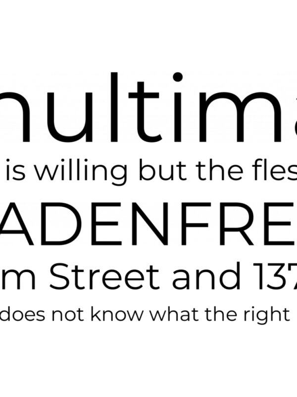
Imagine, for example, this blog was in this font. It now feels like you’re reading the letters of Jane Austen. Or Charles Dickens. Or someone with a feather quill from times of old.
What that scientific experiment shows is fonts make more than a cosmetic difference. There’s nothing objectively wrong with that font; it didn’t look right because it was ill-fitting with our brand and the tone of our blogs.
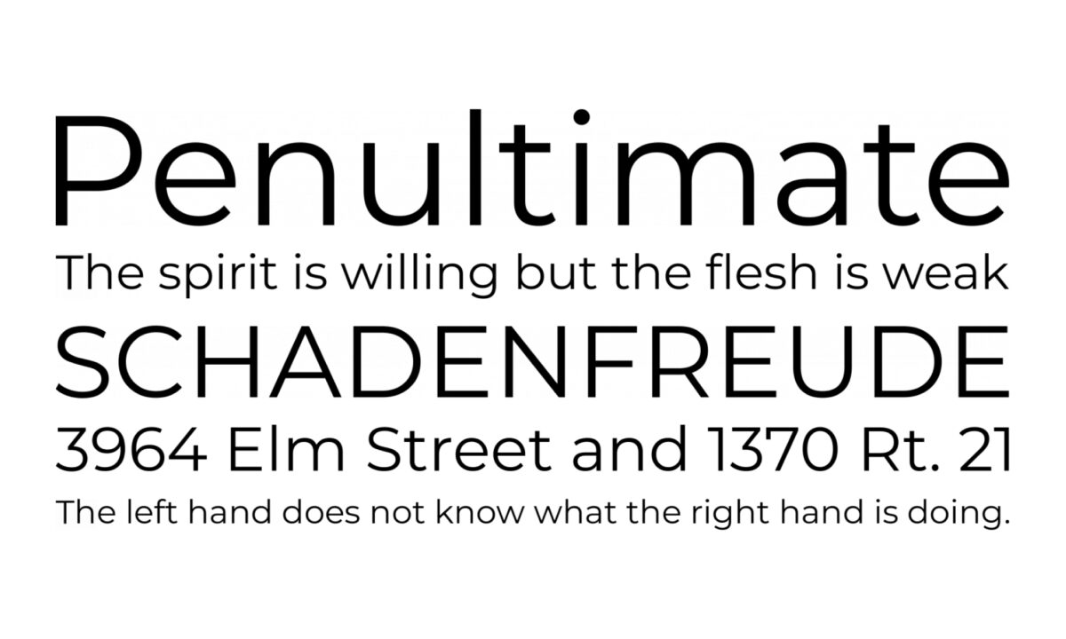
Fearing these conspicuous, out-of-place missteps, B2B brands often resort to an overfished handful of fonts, playing it safe with the long-established and tried-and-tested. This, dear reader, is where we find Montserrat. Its paper-thin but oil-tanker-wide characters are increasingly, unfortunately ubiquitous in B2B marketing. So what alternatives are out there, and how can you find fonts that help your B2B brand stand out while making the right impression?
Font misconceptions
There are a few stale ideas kicking around about what certain fonts convey. Take trusty Times New Roman, for example: the go-to for traditionalism, intelligence or academic content. Tech businesses, meanwhile, typically lean heavily into geometric, sans-serif, Grotesk-style fonts for their clean edges and unfussy, functional look.
But tech doesn’t have to mean straitlaced. The binary ‘serif fonts equal classical; sans-serif equal modern’ rule limits your combinations and inhibits freshness. A serif can still appear clean; sans-serif can still show elegance and flair.
These repetitive patterns are largely the result of Google fonts being overused because they’re free and accessible. When we undertake competitor analysis for branding work, we often find an industry is using Google system fonts that all look the same. But there are swathes of them that are less used, instantly providing a fresher visual identity.
Differentiate yourself from competitors by experimenting with non-standard pairings, rather than the conventional bold display, simple body. It might be your main body font where you want to bring out character instead, with a softer, subtler display. Complementary doesn’t mean they have to look as close as possible to each other. A hard-edged, angular display paired with a rounded, curvy body, for example, offers counterpoint, especially if the opposite is most common among your competitors.
Case in point: New Balance, a sports brand with a serif up its sleeve. Its font gestures towards the retro style of the products, while simultaneously setting them apart from their competitors’ overwhelming use of sans-serifs to express precision and stripped-back utility.

So what’s caught our creatives’ eyes when it comes to red-hot fonts, rising stars – and any they’d consign to the design dustbin?
Maria, Senior Designer:
- Shout out: Relative
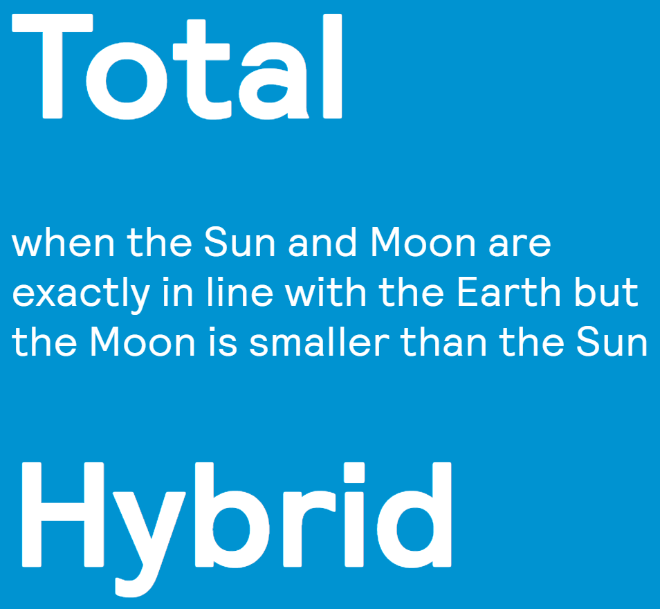
“I’m a nerd for geometric sans-serif typefaces because of their roundness and general visual loveliness. And this one, from the great UK type foundry Colophon, has features like a nice little subtle kick on the A. These finer details – which can be overlooked – add more points of interest and can reinforce the playfulness of the copy or the wider branding.”
- Sin bin: Montserrat
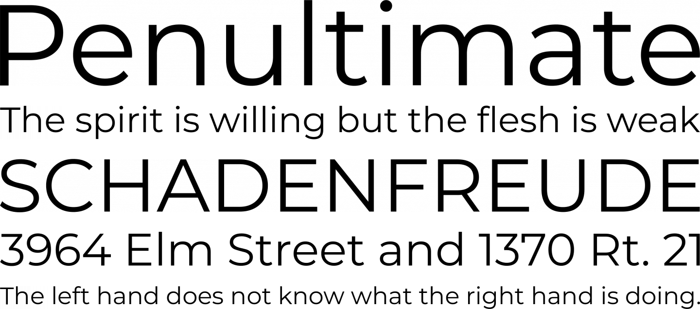
“Not only is it unoriginal, but no matter how much designers or writers try to finesse the copy, it just inherently ends up looking stretched and blocky. It sticks out like a sore thumb to me, and there’s little you can do to make it appealing or easy on the eye."
Jay, Designer:
- Shout out: Eiko

“It’s a font that’s clearly been crafted and made to look different – I like the A, for example, with its roundness and sharpness. It’s Japanese-inspired and stands out for me. I always love a letter A when it’s a double-storey – they’re so underused. I sometimes see typography as a mannequin, in that its real identity comes from what you dress it in – the colour and imagery it pairs nicely with.”
- Sin bin: Coolvetica
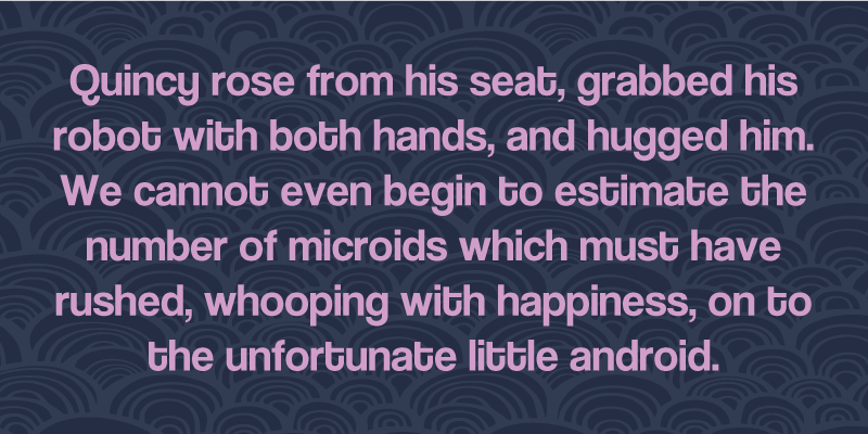
“This one’s at the opposite end of the craft scale in my view. I think it tries too hard – there’s too much emphasis on the curves of the letter T, for example. And the fact it’s called Coolvetica makes me want to eat glass.”
Danni, Designer:
- Shout out: Garnett
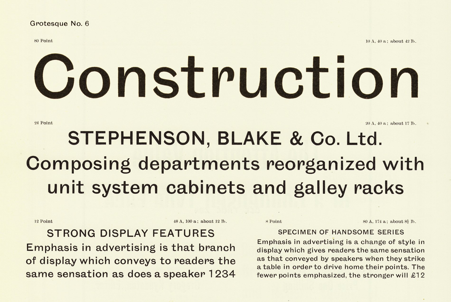
“I like fonts like these that have a little quirkiness to them, but are still legible and not ridiculous. It’s the best of both worlds in that it’s a sans-serif but still has some of the serif-style flicks that give it a flow and smoothness. And it looks good in all weights – which not all fonts do.”
- Sin bin: Roboto Slab
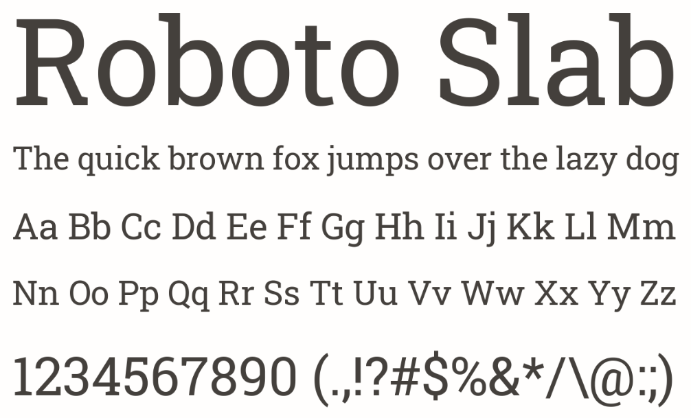
“The clue’s in the name: it’s robotic. And ‘slab’ gets at the ugliness of its shape – slightly tall and compressed – which makes it hard to work with, and visually unappealing. The odd couple of serifs make a half-hearted attempt to create some interest, but there’s no disguising that it’s a boring, plain, underwhelming choice.”
Final checks for your font
There are a few crucial checks to confirm that a font will fulfil your needs.
- Width
A font like Monsterrat can look off-putting to read and inefficient with space. Condensed fonts, on the other hand, might be efficient with space, but less easy to read, while feeling robotic and impersonal.
- Caps and weights
You want the versatility of weight options, but your font can look drastically different, with characters that are suddenly hideous, illegible or ‘a bit much’ staring back at you. Some copy – acronyms, for example – relies on capital letters, so they need to look in-keeping, as well.
- Different sizes and formats
Test it in a compact Instagram square, report cover and full page of copy, so you know it can serve a variety of content marketing and creative needs.
- Numbers
These will often have their own style, with tails that might feel overly ornate or clash against your brand shapes and visual style. Some fonts’ numbers sink below the line to create a jumble of wonky heights. Any of this can be detrimental if your copy is typically stat- or data-heavy.
Fonts are one facet of Don't be Shy's meticulous brand work, ensuring our clients aren’t just putting their best font forward, but their best face to market. Get in touch if this sounds like something we can help you with.
